-
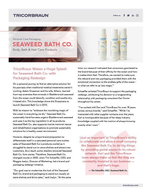
Case Studies - Personal Care Seaweed Bath Co.
TricorBraun helped Seaweed Bath Co. with a redesigned and more sustainable packaging solution, as well as a new supply chain strategy. Learn more.
-
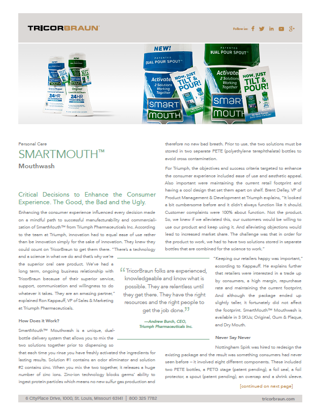
Case Studies - Personal Care Mouthwash
TricorBraun and SmartMouth teamed up to create unique packaging for the SmartMouth mouthwash bottle. Learn more.
-
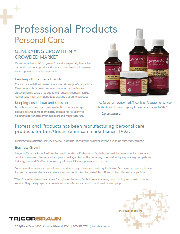
Case Studies - Personal Care Professional Products Unlimited, Inc.
Learn about the partnership between TricorBraun & Professional Products’ Groganics & how it led to innovative packaging.
Eufora

New Eufora Performance Promise Collections Launch in Packaging Designed by TricorBraun Design & Engineering
Eufora International, a leader among makers of high-quality salon hair care products, is committed to delivering people- and planet friendly products to the professional salon market and the consumer community it serves. In its first 10 years, Eufora has experienced consistent growth of both its market reach and its product lines.
In 2013, Eufora began a reorganization of its salon product lines from the traditional functional groupings (cleansing, conditioning, styling, finishing) into distinctive branded collections, such as Curl’n, a complete regimen for all types of curly hair, and Smooth’n, a regimen to smooth and soften hair and control frizz.
“Packaging is an important part of our connection with the stylist and our consumer, and making a change in that packaging creates a challenge.”
—Beth Bewley, CEO & Co-Founder, Eufora International
“Each Eufora product will now be part of a Performance Promise collection brand,” explains co-founder and CEO Beth Bewley. “Each collection will bring together a group of products that contribute to that collection’s central Performance Promise.” As part of this extensive realignment of its existing product lines, Eufora also redesigned its packaging to project the new brand identities and their promise.
First steps. Eufora worked closely with TricorBraun Design & Engineering to create the packaging for the new collections. The first – the Curl’n brand – was launched with its own distinctive brand image in late 2013, followed by the Smooth’n brand in April 2014. These will be followed by a Nourish collection and a Volume collection, both expected to be in place by August 2014. The TricorBraun/Eufora collaboration began in late April 2013 with a face-to-face meeting between the TricorBraun Design & Engineering team and Eufora’s CEO Beth Bewley and Design Director Derek Hutcheson.
Primary in the guidance that Eufora gave the design team upfront was the objective that the packaging be distinctive from the company’s existing packaging, yet not so different that it no longer looked like a Eufora product. The existing packaging consisted of custom square white plastic bottles with soft corners and pressure-sensitive labels across two panels, topped by a custom molded closure with the Eufora leaf molded into the top. The Eufora goal was to project “new” while leveraging the 10 years of brand equity of that earlier design.
Eufora sells through distribution to salons, both use the products in the salon and also sell the at-home care products to their customers. It was critical to the company that both stylists and consumers recognize that the Performance Promise collections were part of the trusted Eufora products they had come to rely on.
“The early design concepts we viewed were excellent,” says Derek Hutcheson, “but they weren’t quite there – and we expected that. The early stage in design is a feeling out process. But among them was one with we what we called a ‘waterfall’ feature that led us to our final design. The result was an evolutionary look for the bottle plus a design element around which to create distinctive decoration and labeling.”
The waterfall design takes the original Eufora square bottle and sweeps a new surface down from the neck across two of the sides, softening the shape of the bottle while still retaining the overall look and feel of the square bottle.
Parting line challenge. Bewley points out that one challenge with the waterfall design was that the most efficient way to mold the bottle would leave the mold parting line running directly through the waterfall face – the most visible space on the bottle. If that line detracted from the smooth plane of the surface, it would lessen the brand impact of the bottle.
However, since the molds were to be built at TricorBraun’s Mold Design and Engineering Center in Lake Elsinore, CA, TricorBraun’s team had complete control of the mold design, and was able to make the line virtually invisible. “In the finished bottles, if you did not know where to look,” says Bewley, “you would not be able to see it.” Look and feel. All thirteen bottled products in the Curl’n and Smooth’n lines feature the waterfall design, and are distinguished from each other by color and by size. The color ranges from dark magenta and blue to silver and white, and each bottle is silk-screened with its product name and information in English and French. Cleansing products are in white and conditioning products in silver and gray, and special treatment or preparation products are in solid colors. This makes it easier for both consumer and stylist to identify products quickly.
The overall look of the line is unified by the Eufora brand label on the lighter colors matching the body colors of the darker bottles. The pressure-sensitive label itself simply has the name Eufora against a subtle background of a stylized version of the Eufora leaf brand image. The colors have a subtle metallic look, and the bottles are also molded with a soft-touch feel, both for an added touch of elegance and for ease of handling with wet hands. Each line includes a tube, the Curl’n tube in a metallic pink and the Smooth’n tube in dark gray, each with the Eufora label.
The bottles are molded by Classic Containers using molds designed and built by TricorBraun. The bottle pumps are made by Aptar and WestRock, the bottle closures by Giflor and the tube closures by Aptar. Berry Plastics manufactures the tubes. Eufora designed and provided the labels.
“Packaging is an important part of our connection with the stylist and our consumer,” says Bewley, “and making a change in that packaging creates a challenge. If we made too dramatic a change, we risked losing 10 years of brand equity; if we didn’t make a dramatic enough change, we risked not communicating the improvements and product additions we have made to the lines.
We gave TricorBraun designers very little specific direction as to the package design, but stressed that we wanted to evolve to a new look. With their help, we were able to retain enough visual cues to our earlier packaging to protect equity but still project newness, freshness and excitement.”
TricorBraun Design & Engineering Group is a business unit of TricorBraun, one of North America’s leading providers of rigid, corrugated and flexible packaging. Our team’s primary mission is to design, engineer and manage the development, production and commercialization of custom packaging solutions for personal care, cosmetics, healthcare, food and beverage, industrial household chemical and animal health products. It is supported by TricorBraun’s more than 40 offices globally, holding one of the largest inventories of rigid packaging components worldwide.

Download Case Study
Our Case Studies about the packaging industry tell the full story behind some of our very best packaging solutions. To save a copy of this specific case study, just click the button below.
Recommended Products
-
 SKU#: 313265GP150 oz Paper Fiber Detergent Bottle with PET Liner and Non-Dispensing Dosage Cup with SpoutClick for price
 -
 SKU#: 31325216 oz Brown Paper Fiber Boston Round Bottle with PET Liner 28-410 Neck Finishprice text as low as $1,323.03 Pallet
 -
 SKU#: 31325016 oz Brown Paper Fiber Boston Round Bottle with HDPE Liner 28-410 Neck Finishprice text as low as $1,502.70 Pallet
 -
 SKU#: 30656528-410 White PP Customizable Flip Top Dispensing Closure - .250 Orificeprice text as low as Special Order Item. Minimums apply.
 -
 SKU#: 30557628-410 White and Blue HDPE Lotion Pump - 6.45" Dip Tubeprice text as low as Special Order Item. Minimums apply.
 -
 SKU#: 2660879 oz Clear Glass Straight Side Jar 70-2030 Lug Neck Finishprice text as low as Starting at $3.10 Case
 -
 SKU#: 311327Chubby Gorilla Clear 115 mm PET CR Spiral Tube with Solid Black Closureprice text as low as Special Price $150.00 Case Regular Price $300.00 Case
 -
 SKU#: 311333Chubby Gorilla Opaque Black 1 Liter ml PET CR Aviator® Base Bottle with Solid Black Closure and Clear Dosing Cupprice text as low as Special Price $52.50 Case Regular Price $105.00 Case
 -
 SKU#: 311335Chubby Gorilla Opaque White 1 Liter PET CR Aviator® Base Bottle with Solid White Closure and Clear Dosing Cupprice text as low as Special Price $52.50 Case Regular Price $105.00 Case
 -
 SKU#: 311282Chubby Gorilla Clear 2 oz PET CR Spiral Container with Solid Black Closureprice text as low as Special Price $300.00 Case Regular Price $600.00 Case